
On your computer your Wix site looks polished. On your phone the text overlaps, images slide off the edge and the buttons are too small to tap. This is the most common complaint we hear from Wix owners, and the good news is that almost every case has a simple cause and a fix you can do yourself. Below you will find why it happens, the fixes step by step, a complete checklist to audit every page, and how to test your work the way a customer would.
Why Wix sites break on mobile
Wix does not simply shrink your desktop pages. It builds a separate mobile version of your site, and the automatic conversion is only a rough draft. Elements that sit comfortably side by side on a wide screen get squeezed into a narrow one, and the order, spacing and sizes the converter guesses are rarely the ones a person would choose. Most broken mobile sites share one history: the owner designed on a laptop, pressed publish, and never opened the site on a real phone.
That matters more than it used to. Google now judges your site mainly by its mobile version, a method called mobile-first indexing, and Google’s own best practices explain why a broken mobile layout hurts the whole site. A layout that fails on phones drags down your rankings for everyone, not just for people visiting on mobile.
The most common mobile problems and how to fix them
Work through these six problems in the mobile editor. Between them, they account for nearly everything that makes a Wix site look broken on a phone.
Text overlapping other elements
Text boxes that sit close together on desktop get compressed on mobile until they sit on top of each other. Open the mobile editor, select each overlapping box, and move or resize it until every block has clear space around it. Trim long headlines on mobile where you can: a heading that works at desktop width often needs fewer words on a phone.

Images running off the screen
Wide desktop banners crop badly on narrow screens and can push the whole page sideways. Resize images in the mobile editor so they fit the screen width, and reset the focal point so the important part of the picture stays visible. For hero images, a taller phone-friendly crop usually works better than the wide desktop banner.
Text too small to read
Words that look elegant on a large monitor become an effort on a phone screen. Set mobile body text to at least 16 pixels and keep headings clearly larger. If visitors have to pinch and zoom to read you, most will simply leave. Our guide to why mobile visitors leave a Wix site covers the other quiet reasons phones lose you customers.
Buttons too small, or half off the screen
Buttons sized for a mouse shrink into targets a thumb cannot hit, and wide button rows can slide off the edge. Make mobile buttons full width or at least thumb-sized, leave clear space around them, and check that your main call to action is fully visible without any sideways scrolling.
Desktop clutter crowding the phone view
Decorative strips, sidebars and wide galleries that look great on desktop often wreck a phone layout. Wix lets you hide elements on mobile only, without deleting them from desktop. Hide anything that does not earn its place for a phone visitor, and the page reaches its point faster.
Menus and forms falling apart
Multi-column menus and wide forms collapse badly on small screens. Switch to a simple hamburger menu on mobile, and stack form fields in one column with tall, easy tap targets. Then prove it works: submit the form from your own phone and check that the message arrives.
The complete Wix mobile-friendly checklist
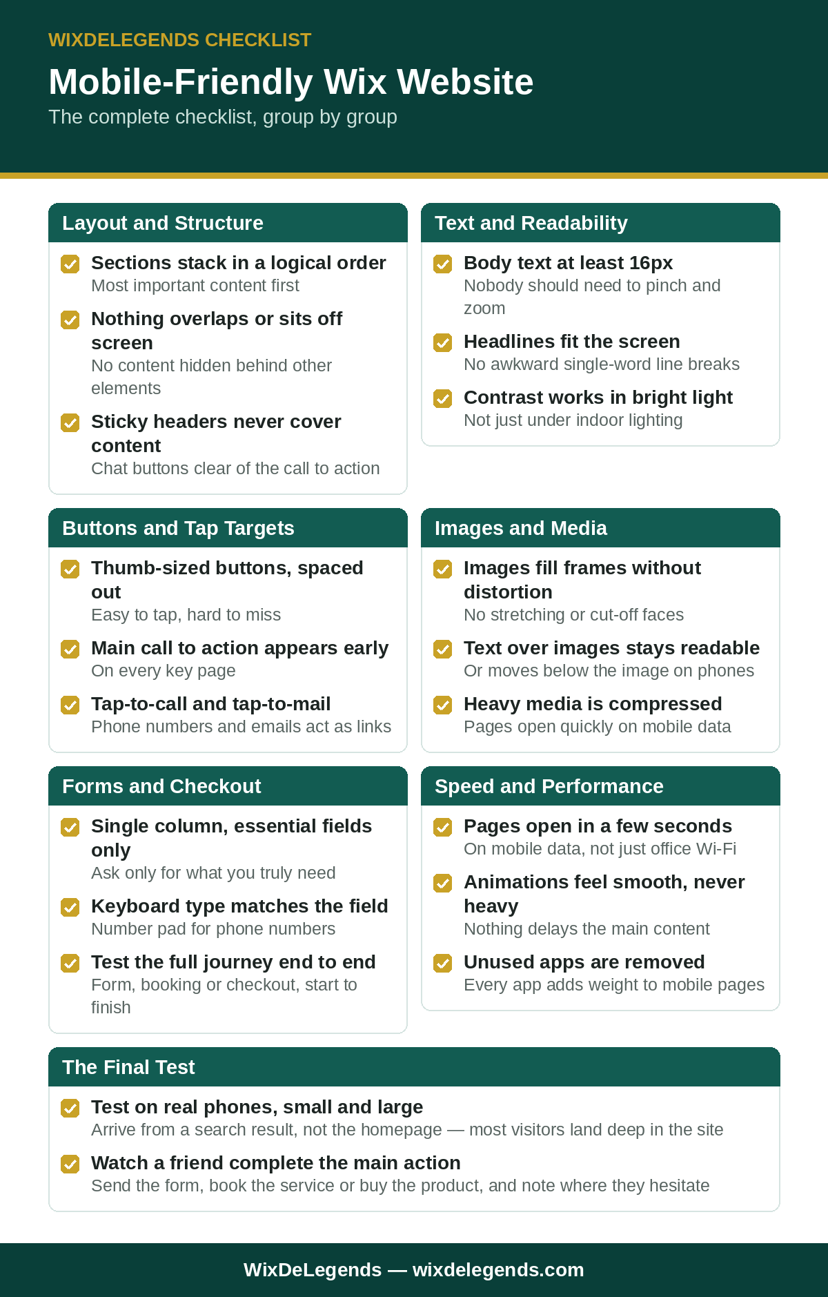
Fixing today’s problems is only half the job. Run this checklist on every key page to catch the next problems before your visitors do. You can also use the free printable checklist at the end of this post and tick items off on paper as you go.
Layout and structure
- Sections stack in a sensible order, with the most important content first.
- Nothing overlaps, sits half off screen, or hides behind another element.
- Multi-column layouts collapse to one column without squeezing the content.
- Spacing between sections is even, with no huge gaps or cramped blocks.
- Sticky headers and chat buttons never cover content or calls to action.
Text and readability
- Body text is at least 16 pixels, so nobody needs to pinch and zoom.
- Headlines fit the screen without breaking into awkward single words.
- Long desktop paragraphs are split into short, scannable lines.
- Text stands out clearly from its background, even in bright light.
- Links in text are easy to spot and far enough apart to tap accurately.

Buttons and tap targets
- Every button is large enough for a thumb, with clear space around it.
- The main call to action appears early on every key page.
- Menu items open and close smoothly, and submenu items are easy to tap.
- Phone numbers are tap-to-call and email addresses are tap-to-mail.
- Nothing important sits at the very edge of the screen where thumbs struggle.
Images and media
- Images fill their frames without stretching, squashing, or cutting off faces and products.
- Text placed over images stays readable, or moves below the image on mobile.
- Videos play inline without forcing sideways scrolling or covering the page.
- Galleries swipe smoothly and captions stay visible.
- Heavy images and videos are compressed so pages open fast on mobile data.
Forms and checkout
- Forms ask only for essentials and sit in a single column.
- Fields are tall enough to tap, and the keyboard matches the field, such as a number pad for phone numbers.
- Error messages appear where the visitor can actually see them.
- The full journey works on a phone: submission, booking or checkout, start to finish.
- Confirmation messages display properly after submitting.
Speed
- Key pages open within a few seconds on mobile data, not just on Wi-Fi.
- Animations feel light, and nothing delays the main content appearing.
- Unused apps are removed, because every app adds weight to the page.
- Images and fonts are sized for mobile instead of serving desktop-sized files.
If speed is your biggest failure point, our guide on how to speed up a Wix website goes deeper on each cause and fix.
Mobile editor vs desktop: what to check in each
The desktop editor and the mobile editor are two views of one site. They share content but keep separate layouts, and knowing which view controls what saves hours of confusion.
The desktop view is the source of your content and brand. Page structure, sections, words, images and colours are set there, and changes to that content flow through to mobile. If a page says the wrong thing, fix it on desktop, because the mobile view cannot rewrite your copy. The mobile view controls only how that same content is arranged on a narrow screen: section order, spacing, text sizes for phones, and which elements are hidden on mobile.
The reassuring part is what mobile editing cannot do. Reordering, resizing or hiding elements on mobile never deletes or shrinks anything on desktop, so mobile fixes carry no risk for your desktop design. The one exception is content itself: edit the words or swap an image, and both views update.
Before publishing, check the desktop view for correct wording, working links, sharp images and a menu order that matches the journey you want visitors to take. Then check the mobile view by walking each page top to bottom: sensible order, nothing overlapping or running off the edge, readable text sizes, a menu and buttons you can tap at preview size, and forms in one clean column with a visible submit button.
How to test on real devices
The editor preview is a simulation, and it hides real behaviour: true tap accuracy, keyboard overlap, loading speed on mobile data, and readability in bright light. Before you call the mobile version finished, open the live site on at least one real phone, ideally a smaller and a larger one. Turn the phone sideways and back. Arrive from a search result rather than the homepage, because most visitors land deep in your site. Tap every button, scroll every key page top to bottom, and complete the main action your business wants, whether that is sending the form, booking the service or buying the product.
Run the checklist again every time you publish a new page, and at least once a quarter for the whole site. Small edits creep in, and the quarter you skip the check is usually the quarter something quietly breaks. In our work with 500+ Wix clients, a five-minute phone test still catches something the preview missed almost every time.
When the fixes are bigger than an evening
If you have worked through the checklist and pages still misbehave, or your site has dozens of pages to repair, doing it alone becomes a long project. Our Wix mobile optimisation service rebuilds every page for phone and tablet across the Classic editor, Studio and Harmony, and proves each page on real devices before sign-off. For step-by-step platform guidance, the Wix Help Center documents the mobile editor in detail.
Frequently Asked Questions
Does Wix make my site mobile-friendly automatically?
Only partly. Wix builds a mobile version of your site for you, but the automatic layout is a starting point. Text sizes, spacing, element order and hidden clutter all need a manual pass in the mobile editor before the site is genuinely phone-friendly.
Why does my site look right in the preview but wrong on my phone?
The preview simulates one tidy screen size. Real phones differ in screen size, browser and pixel density, and they add real tap behaviour, keyboards and mobile data speeds. That is why the live site on a real phone is the only test that counts.
Can I fix mobile problems without changing my desktop site?
Yes, in almost every case. Layout changes in the mobile view, such as reordering, resizing and hiding elements, affect phones only. Your desktop design stays untouched unless you edit the shared content itself, like the words or images.
What is the first thing to check when my Wix site looks broken on mobile?
Open the mobile editor and walk the page from top to bottom. Look for overlapping text, images running off the edge, tiny body text and buttons that are too small or half off screen. Those four cover most broken mobile pages.
How often should I repeat the mobile-friendly checklist?
Run it every time you add a page or change a layout, and at least once a quarter across the whole site. Most mobile problems creep in through small everyday edits, not big redesigns, so regular short audits beat rare long ones.
Does a broken mobile site really affect my Google rankings?
Yes. Google mainly uses the mobile version of your site when it decides rankings, a method called mobile-first indexing. A page that overlaps, hides content or loads slowly on phones can lose positions even for people searching on a desktop.
Tired of fighting the mobile editor? Get a free quote and we will make every page of your Wix site flawless on phones and tablets.
Pingback: Why Is My Wix Site So Slow? 8 Fixes That Actually Work – WixDeLegends
Pingback: Wix Website Not Working? 12 Common Problems and How to Fix Them – WixDeLegends