
Wix Mobile Optimisation That Makes Every Visit Count
Most of your visitors arrive on a phone — and if your site greets them with squeezed text, overlapping buttons and scrolling, they leave within seconds. Our service rebuilds your mobile view page by page, so your website looks polished on every screen.
Why Your Phone Layout Deserves Its Own Project
In our work with 500+ Wix clients, the mobile view is the most neglected part of most sites we review. The desktop design gets all the love, while the version most customers judge you by is left to chance.
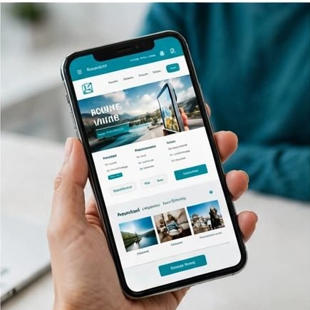
Keep the Visitors Google Sends You
Google judges your site mainly by its mobile version. When we make your Wix website responsive in practice — readable, tidy, quick — you protect the traffic you have already earned.
Turn Phone Browsers Into Buyers
Thumb-sized buttons, a click-to-call number always within reach, and text you can read without pinching. Small comforts like these persuade a mobile visitor to enquire instead of bouncing.
Look Professional on Every Screen
No more cropped headlines, pictures swallowing the page, or a menu opening off-screen. A deliberate mobile layout makes a small business look as trustworthy on a handset as on a monitor.
Shorter Waits, Longer Visits
Mobile pages carry less clutter after optimisation: heavy sections are trimmed or hidden on phones and images sensibly sized, so visitors reach content sooner — and stay.
What Our Wix Mobile Optimisation Service Covers
This is careful handwork inside your mobile editor — not a one-click tidy-up that shuffles everything into a single column and calls it done.

A Proper Fix for Your Mobile View
We fix your Wix mobile view page by page: repositioning elements, reordering sections so key information comes first, and removing collisions that make pages look homemade.
Text and Spacing Correction
Font sizes set for arm’s-length reading, line breaks repaired and breathing room restored around headings and paragraphs, so long pages feel calm instead of cramped.
Menus and Buttons Built for Thumbs
Navigation that opens cleanly and closes when it should, buttons large enough to tap first time, and enquiry forms that no longer stretch past the screen’s edge.
Heavy Elements Hidden or Restyled
Wide galleries, decorative strips and desktop-only features that slow phones are hidden on mobile or swapped for lighter alternatives — your desktop design stays untouched.
Testing Across Real Screen Sizes
Before anything goes live, pages are checked across common phone and tablet widths in both orientations, so no surprises wait on a customer’s particular handset.
Before-and-After Screenshots
You receive side-by-side screenshots of your key pages, so the improvement is something you can see and judge — not a promise taken on faith.
Curious how the mobile version works? The Wix Help Center explains it clearly — and shows why most owners hand this fiddly job to us.
How We Optimise Your Mobile Site
A short, transparent process. Your live site keeps running throughout, and nothing is published until the new layout has been tested.

Step 1 — Mobile Audit
We work through every page at phone sizes and list the faults — what overlaps, what hides, what loads slowly — ranked by how much each one hurts you.
Step 2 — Agree the Priority Order
Together we decide where to start, almost always the homepage and the pages that make you money. You approve the plan and fixed price before editing begins.
Step 3 — The Mobile Rebuild
We adjust layouts, text, menus and imagery inside the mobile editor. In Wix Studio we fine-tune each breakpoint instead, so tablets get their own polish.
Step 4 — Device Testing and Launch
Finished pages are tested across devices, published, and sent to you as before-and-after screenshots, with a lesson on checking edits on mobile.
Specialists in How Wix Behaves on Mobile

Each Wix editor handles small screens differently: Studio works through responsive breakpoints, the Classic editor keeps a separate mobile view, and Harmony follows its own rules again. We optimise sites in all three every week for our 500+ clients, so yours gets the technique matching its editor — never a generic workaround.
Because the job uses Wix’s native mobile tools, you stay in charge afterwards: add a page and you will know how to give it the same tidy treatment. And if an edit knocks something out of place, you come back to us.
Mobile Optimisation Questions, Answered
What owners usually want to know before we touch their mobile view.
The editor preview shows one tidy example width, while real phones come in dozens of screen sizes — and your phone may also be showing an older saved copy of the page. We check your pages across common real-world widths in both orientations, which is how the faults your customers actually see get found and fixed.
Expect layout repairs on every page: resized elements, corrected text sizes, menus and buttons made properly tappable, and desktop-only clutter hidden from phones. You approve the fault list first, so scope is clear.
No. In the Classic editor the mobile view is edited completely separately, and in Wix Studio we adjust smaller breakpoints without disturbing the desktop design. Computer visitors see exactly today’s site.
Not at all. A Classic editor site can have an excellent mobile version with the right manual work. Studio is worth discussing only if you want one design that fluidly adapts to every width.
A typical site of five to ten pages takes two to four working days, including the audit and device testing. Larger stores and booking sites take a little longer; we confirm the schedule with your quote.
Yes. Layout faults often appear on one family of devices and not the other, so your key pages are checked across iPhone and Android screen sizes before anything goes live. You receive before-and-after screenshots, so you can judge the improvement on evidence rather than promises.
It removes obstacles: Google reads the mobile version first, so unreadable text and hidden content hold you back. Optimisation will not replace SEO, but rankings work is wasted on a site phones cannot use.
Complete the Picture
Mobile work often uncovers bigger opportunities. These are the natural next steps our clients take.
 Wix Design & RedesignIf the mobile faults run deep, a full redesign rebuilds desktop and phone layouts together.
 Speed OptimisationSlow pages hurt mobile visitors most of all — we cut loading times across your whole site.
 Fix Wix IssuesFound something broken while browsing on your phone? Send it to us for a lasting repair.
Ready to Look Perfect on Every Phone?
Ask for a free mobile audit of your Wix site. We will show you what your phone visitors see today — and what they could be seeing instead.
Optimise My Mobile Site